14.10.2022- 13.11.2022 (Week 7- Week 11)
During the process, I use rectangle shapes and Pen Tool to outline the letters. I designed the counter space with the same amount of thickness between the 2 stems, which is 94pt width.
Leong Jia En (0348366) Bachelor of Creative Media Design (Minor)
Typography
Task 3
Lectures
Instructions
Task 3: Type Design & Communication
In this project, we were required to design the letters: a e t k g r i y m p n ! # , . in order to learn how to create a good typeface regarding subtlety, character, presence, legibility and readability. We started with research, sketches and identifying and deconstructing references.
Research
As mentioned in the briefing, we should adhere to the typography guidelines such as baseline, x-height, median line, cap line, ascent line and descent line.
Fig 1.0 References: https://yesimadesigner.com/get-familiar-with-type-anatomy/ (15/10/2022)
Since I like Serif fonts the most, I started researching different types of Serif fonts and studying the styles and characteristics of each to gain a better understanding of the font structure and to be able to slowly produce my fonts.
The Serif font category can be broken down into four subgroups:
1. Old Style Serif Fonts
Old Style Serif Fonts is inspired by calligraphic art sometime in the 15th century. It has certain peculiarities such as thick-to-thin transitions, slanting serifs on lowercase letters, and ending strokes that are rounded, just as they would be in calligraphy.
Eg: Times, Baskerville, and Garamond
Fig 1.1 References: https://pin.it/6G6etgr (15/10/2022)
2. Transitional Serif Fonts
Transitional serif fonts are known as such because they were popular during the period between the Old Style fonts and modern-day typefaces. The thick-to-thin transitions are more pronounced than in the previous serif styles.
Eg: Times New Roman, Bookman, Georgia, and Cambria.
Fig 1.2 References: Fontscape Home > Classification > Serif > Transitional (15/10/2022)
3. Didone
These modern serif are easily distinguishable by their thick and thin lines being markedly so. Vertical lines are usually quite heavy, while horizontal lines and serifs are much thinner.
Eg: Didot and Bodoni families of serif fonts.
Fig 1.3 References: http://www.identifont.com/show?319I (15/10/2022)
4. Slab Serifs
Slab serif fonts are heavy-set fonts with block-like serifs that may be as thick as the vertical lines themselves. Rather than having wedge-shaped or tapering serifs, the serifs here are like rectangular blocks. The thick-to-thin transition has been done away with, giving the font a very heavy look that is ideal for posters.
Eg: Egyptian Slate, Rockwell, Serifa
Fig 1.4 References: https://creativebeacon.com/slab-serif-fonts-15-you-should-use/ (15/10/2022)
The differences between Old Style, Transitional, Modern and Egyptian
Fig 1.5 References: https://medium.com/edinbed/calarts-funds-of-graphic-design-w2-2-6-typeface-categories-7b2f31aea002 (15/10/2022)
Also, I researched Blackletter, a font I thought was interesting in order to have a better understanding of its history and components.
Blackletter
- Blackletter is also known as Old English or Gothic script.
- Blackletter fonts have letters that are very bold and ornate.
- It is a Western calligraphy style that was used in Europe from the 1100s to the 1600s.
- It is distinguished by a uniform treatment of vertical strokes that end on the baseline (e.g: b or l), the use of angular lines instead of smooth curves and circles (eg: b, d, o, or p), and the fusion of convex forms when they occur together (eg: bo and pa).
Examples of Blackletter
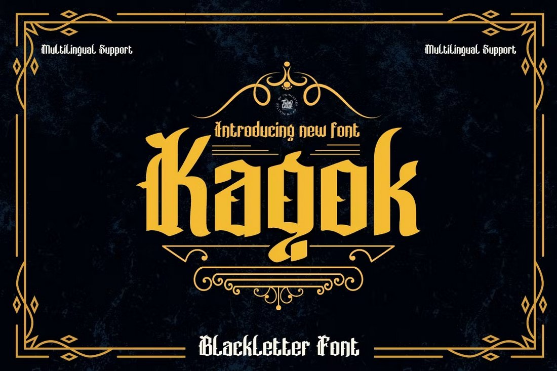
Blackletter is a popular typeface that’s commonly used in vintage and grunge style designs. It’s now also being used in all sorts of modern designs from website design to logo designs, tattoos, and more. Below are some examples of Blackletter designs that I found interesting.
Fig 1.6 References: https://designshack.net/articles/inspiration/best-blackletter-fonts/
Fig 1.7 References: https://designshack.net/articles/inspiration/best-blackletter-fonts/
Fig 1.8 References: https://designshack.net/articles/inspiration/best-blackletter-fonts/
Deconstruction
After doing some research on the typeface, I made some sketches with the letters "OHTA" mentioned by Mr. Vinod in the tutorial video as these are the initial letters that the typographer designed for the typeface.
 |
| Fig 2.0 Sketch of OHTA (16/10/2022) |
Then, we have to deconstruct 3 letters after identifying references to our chosen sketches. The purpose of deconstructing is to learn how the letters are formed with shapes and also to observe the details and slight differences in thickness due to optical or technical reasons. Deconstructing references - type appreciation, study anatomical parts (what are its features, etc).
Out of the 10 typefaces, ITC New Baskerville is my chosen reference as it looks similar to my sketch #4 of the letters OHTA. Below I chose to deconstruct the letters p,d and m which were suggested by Mr.Vinod during the tutorial briefing.
.png) |
| Fig 4.0 Deconstruction of p,d,m (16/10/2022) |
 |
| Fig 4.1 Deconstruction of p (16/10/2022) |
 |
| Fig 4.2 Deconstruction of d (16/10/2022) |
 |
| Fig 4.3 Deconstruction of m (16/10/2022) |
By deconstructing the letters, I observed that even though all letters appear to be the same height, the circles are slightly larger which is so-called "overshoot". For example, o, d, p, and m. This is because round shapes appear smaller than geometric shapes. The letters would appear disproportionate if we adjust the round shape to even equal height.
Sketches
After gaining a solid understanding of type design, we can start sketching specific letters (a e t k g r i y m p n ! # , . ). I picked 5 letters out of them which are k, g, y, m and p to start sketching my type design. I mainly designed serif fonts based on my accumulated knowledge from research and construction. I began by sketching more standard and normal serif fonts for my first design to get a better flow in the future. In addition, I tried out one sans serif font to learn the differences. Also, I tried to combine serif fonts and blackletter in sketch #3.
 |
| Fig 5.0 Sketch #1 of k,g,y,m,p (17/10/2022) |
|
I then proceeded to complete the sketching of all the provided letters after I'm satisfied with previous attempts.
 |
| Fig 6.2 Sketch #3 of a e t k g r i y m p n ! # , . (18/10/2022) |
 |
| Fig 6.3 Sketch #4 of a e t k g r i y m p n ! # , . (19/10/2022) Fig 6.4 Sketch #5 of a e t k g r i y m p n ! # , . (19/10/2022) |
Refined Sketches
After receiving feedback from Mr.Vinod, I decided to go with sketch #3. I have refined the letter "g" after doing research and also the letter "p" as suggested by Mr. Vinod.
 |
| Fig 7.0 References of serif "g" (28/10/2022) |
 |
| Fig 8.0 Refined Sketch #3 (28/10/2022) |
Digitized Final Type Design
Before starting to digitize my type design, I created a 1000 x 1000pt artboard and inserted guides lines. I set the X-height to 500 px in a shape as required. The ascender and descender lines must be also within the artboard.
.png) |
| Fig 9.0 Guides Lines (29/10/2022) |
 |
| Fig 10.0 Counter Space (29/10/2022) |
In order to make the letters look consistent, I reused and duplicated the shape as shown below.
 |
| Fig 10.1 Shapes (29/10/2022) |
The image below shows how I construct all the given letters by using rectangle shapes and Pen Tool. In the end, I combined base shapes with a pathfinder.
.png) |
| Fig 11.1 Construction of a e t k g r i y m p n ! # , . (29/10/2022) |
 |
| Fig 11.2 Digitized type design with guides (29/10/2022) |
 | |||
| Fig 11.3 Digitized type design (29/10/2022) Refined Progress Before refining the punctuation design, I researched the form of punctuation and watched the Instagram video mentioned by Mr. Vinod. Fig 12.0 References: https://www.instagram.com/p/CRjdPtSjz5K/?utm_medium=copy_link&fbclid=IwAR1r4UNnpcjRIGRbmA_t4cfB3Oie3F2sy-bZC0Q3AFWn8t_j7ctcPp4g400 (4/11/2022)
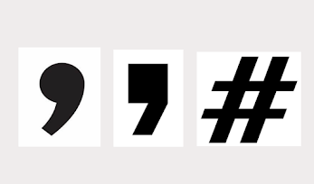
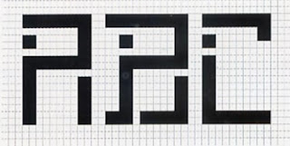
I changed the horizontal stroke weight of # to be thinner and redesigned the comma to be consistent with the full stop. I also adjusted the angle of each letter for consistency. Due to the adjustment of the angle, some of the originally designed letters will exceed/do not reach the x-height, thus I redesigned the letter r and y in a more appropriate way as shown in figures 15.0 and 15.1. Fig 14.0 Refined Angles (4/11/2022) Fig 15.0 Refined r (4/11/2022) Fig 15.1 Refined y (4/11/2022) Following Mr. Vinod's suggestion, I changed the direction of the g's upper stroke and also adjusted the stroke of the link to be slightly thicker. Lastly, I cut the sharp edges of a and k as shown below. Refined Outcome Fig 16.0 Digitised Type Design with guides line (4/11/2022) Measurement Ascender: 626pt Cap Height: 590pt X-Height: 500pt Descender: -132pt Importing Final Font to FontLab After completing the final font design, I unite the font into a complete vector shape and refer to Mr. Vinod's demonstration video on how to import the font in FontLab. Fig 17.0 Unite Font (5/11/2022) First, we need to name the font we designed, and set the font's x-height, ascender, descender and cap height in the font info. Fig 18.0 Font Info (5/11/2022) Fig 18.1 Font Info (5/11/2022) Fig 18.2 Font Info (5/11/2022) Then, I imported each letter by copying and pasting from Adobe Illustrator to FontLab as shown in figures 19.0 and 19.1. Fig 19.0 Importing Font (5/11/2022) Fig 19.1 Importing Font (5/11/2022) Fig 20.0 Adjusting Left and Right Sidebearing in Metrics Tab (5/11/2022) Fig 20.1 Adjusting Kerning in Metrics Tab (5/11/2022) Fig 20.2 Adjusting Kerning in Metrics Tab (5/11/2022) Fig 21.0 Adjusting p's Angle (5/11/2022) After receiving feedback from Mr. Vinod, I refined # in terms of width as shown below, and import it again to FontLab. Fig 22.0 Adjusting the width of # (11/11/2022) Fig 22.1 Importing # to FontLab (11/11/2022) Fig 22.2 Adjusting sidebearing and kerning 11/11/2022) Poster After exporting the font and installing it on my laptop, I created some posters to showcase the final font design as shown below. Fig 23.0 Poster #1 (5/11/2022) Fig 23.1 Poster #2 (5/11/2022) Fig 23.2 Poster #3 (5/11/2022) Fig 23.3 Poster #4 (5/11/2022) Fig 23.4 Poster #5 (5/11/2022) Final Outcome Font Download: https://drive.google.com/drive/folders/1PbmRtsh2lk7fOe6XYuAvxIbyFwJQmny1?usp=sharing Fig24.0 Final Type Design. JPG (11/11/2022) Fig 24.1 Final Type Design. PDF (11/11/2022) Fig 25.0 Final Poster. JPG (11/11/2022) Fig 25.0 Final Poster. PDF (11/11/2022) Feedback Week 9 General Feedback: We should have deep research and learning before starting to design our typeface and also not allow to modify the existing font. Specific Feedback: The sketch #3 is the best but need to refine the letter "g" and "p". Do research for the serif "g" and be aware of the equal shape and line of "p". Week 10 General Feedback: We should aware of the consistency of type design. Specific Feedback: Overall, the type design is interesting and on the right track. It is better and more common to have consistent angles and cutting the sharp edge of a, k and r. The upper stroke of g can be reversed. The stroke of the hashtag symbol should not be equal. Week 11 General Feedback: It is important to record our progress as evidence of work. Specific Feedback: Excellent and interesting work, just need to refine # in terms of width. Reflection Experience Although it was very difficult in the beginning and time-consuming, my overall experience was good and satisfying. I appreciate the opportunity to create my own typeface, which allows me to better understand the construction of each letter in a practical way. Through this project, I really appreciate typographers who create great fonts. Observations Through this project, I observed that even though all the letters look equal, they have subtle differences when we observe them. We should pay attention to every detail because every minor mistake will affect the overall look of the letter. When designing my own work, I find that consistency is important such as the angle of the typeface design. We need to define our design direction and stick to it to keep it consistent. Findings I found that designing typefaces is time-consuming as it takes a lot of time to study and learn from mistakes when designing our own work. It is not an easy process and the consistency of type design should be considered. Further Reading Thinking with Type, 2nd revised and expanded edition: A Critical Guide for Designers, Writers, Editors, & Students by Ellen Lupton The evolution of typeface design - For more than five hundred years, typeface production was an industrial process. Most types were cast from lead until the rise of phototypesetting in the 196os and 1970s; early digital typefaces still required specialized equipment for design and production. - It was not until the introduction of desktop computers that typeface design became a widely accessible field. - However, making a complete typeface is still a daunting task. Even a relatively small type family has hundreds of different characters, each of which needs to go through many stages of refinement. - The typeface designer must also determine how a font is to be spaced, what software platforms it will use, and how it will function in different sizes, media, and languages. Bitmap Fonts - Bitmap Fonts are built out of the pixels that structure a screen display. - Outline fonts are scalable, meaning that they can be reproduced in a high-resolution medium such as print at nearly any size. - Outline fonts are often hard to read on screen at small sizes, however, where all characters are translated into pixels. - A bitmap font is designed to be used at a specific size, such as 8 pixels because its body is precisely constructed out of screen units. - A bitmap font should be displayed on the screen in even multiples of its root size enlarged 8-px type to 16,24, 32, and so on. - Designing letters on a grid of squares to create a bitmap font. - Substitute the curves and diagonals of traditional letterforms with rectilinear elements. |


.png)


.png)
.png)
.png)
.png)

.png)
.png)
.png)
.png)

.png)
.png)
.png)


Comments
Post a Comment