
29.08.2022- 30.09.2022 (Week 1- Week 5)
Leong Jia En (0348366) Bachelor of Creative Media Design (Minor)
Typography
Task 1 Exercises
Lectures
Week 1
[Introduction]
- Calligraphy is defined as decorative handwriting or handwritten lettering.
- Lettering is the process of drawing an outline of letters.
- Typography is an art of creating a typeface and is widely used in animations, software applications, websites, product labeling, books, posters, signage system, etc.
- Font: The individual font or weight within the typeface.
 |
| Font |
- Typeface: The various families that do not share characteristics.
 |
| Typeface |
[Development]
1. Early letterform development from Phoenician to Roman.
- Letterform was early developed by Phoenicians back in the 4th Century B.C.E.
- As the materials and tools of early writing required (wet clay with sharpened stick/ stone with a chisel), uppercase forms are simple combinations of straight lines and pieces of circles.
 |
| Early letterform development |
- The Greeks then changed the writing direction which was called Boustrophedon style. Lines of text are read alternately from left to right and then right to left. The orientation of the letterforms also changes influenced by the change of direction.
 |
| Boustrophedon |
- The Romans and Etruscans painted their letterforms before inscribing them to prevent any marble waste. This resulted in the formation of Roman letterforms due to the qualities of their strokes and the tools they used.
 |
| The formation of Roman letterforms |
Square Capitals: Written letterforms found in Roman monuments. These letterforms have serifs added to the end of the main stroke.
 |
| 4th or 5th century |
Rustic Capitals: A compressed version of square capitals that allows twice as many words to be written on a single piece of parchment and takes far less time. It is faster and easier but slightly harder to read due to its compressed nature.
 |
| Late 3rd – mid 4th century |
Roman Cursive: Written for everyday transactions, the letterforms have been simplified for speed. It is the beginning of a lowercase letter.
 |
| 4th century |
Uncials: Incorporate some aspects of Roman cursive. The broad Uncials are more readable at small sizes than rustic capitals.
 |
| 4th to 5th century |
Half-uncials: The formal beginning of lowercase letterforms, replete with ascenders and descenders, 2000 years after the origin of the Phoenician alphabet.
 |
| C. 500 |
Caloline minuscule: Charlemagne (the first unifier of Europe since the Romans) issued a decree in 789 to standardize all ecclesiastical texts. He entrusted this task to Alquin of York, abbot of Saint Martin of Tours. The monks rewrote the text using uppercase, lowercase, capital letters, and punctuation, setting the standard for a century of calligraphy.
 |
| C. 925 |
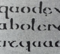
Blackletter (Textura): With the disintegration of Charlemagne's empire, there were regional changes in Alcuin's script. In northern Europe, a condensed strong vertical typeface called Blackletter or Textura became popular. In the South, a more round and open hand, known as the "rotunda", is gaining popularity. The Italian humanistic script is based on Alcuin's trivial.
 |
| C. 1300 |
3. Text type classification
1450 Blackletter👉 1475 Old style👉 1500 Italic👉 1550 Script👉 1750 Transitional👉 1775 Modern👉 1825 Square Serif/ Slab Serif👉 1990 Serif/ Sans Serif
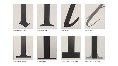 |
| Text type classification |
Week 2
[Basic of Letterform]
- Baseline -The imaginary line of visual base
- Median - The imaginary line defining the x-height of letterforms
- X-height -The height of the lowercase "x" in a typeface
- Stroke - The line that defines a basic letterform
- Apex/Vertex - The point created from the intersection of two diagonal stem (Apex ↑, Vertex ↓).
- Stem - Any vertical line in a letter.
- Arm - Short Strokes off the Stem of the letterform, either horizontal (eg. E, F, L) or diagonal (eg. K, Y).
- Ascender - Stem of a lowercase letterform above the Median.
- Barb - Half-serif end of a curved Stroke.
- Bowl - Rounded form that describes a counter (open or closed)
 |
| Bowl |
- Bracket - Transition between the serif and the stem
- Cross Bar- horizontal stroke in a letterform that joins two stems together
- Crotch - interior space where two strokes meet
- Descender - portion of the stem of a lowercase that projects below the baseline
 |
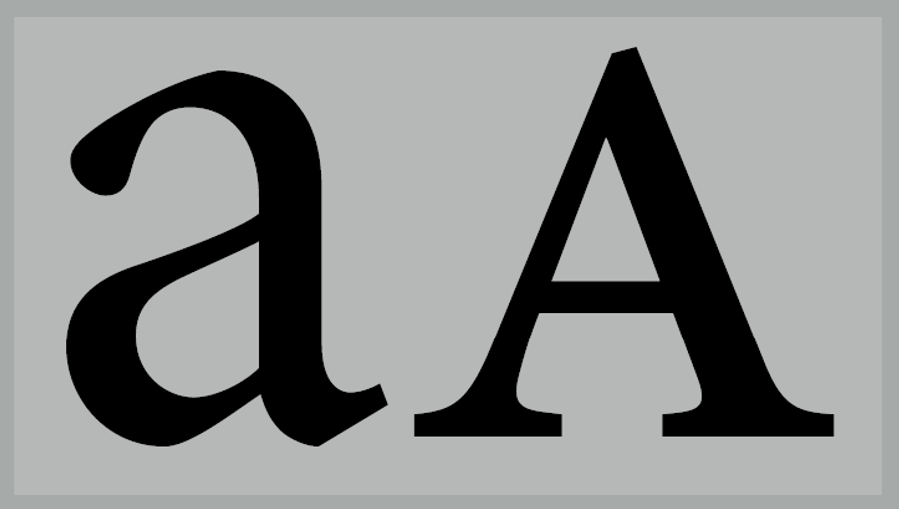
| Anatomy of A Typeface |
- Em - distance equal to the size of the M (—)
- En - Half the size of an em (–)
- Finial- curved of tapered end of a stroke.
- Leg -Short stroke off the stem of letterforms
- Ligature- special character that joined 2 characters to improve the efficiency of reading. For example, fi.
 |
| Ligature |
- Link - Stoke connects the bowl and the loop of lowercase G
- Loop - Bowl is created in the descender of the "g"
- Shoulder - Curved stroke that is not part of a bowl
- Spur - The extension the articulates the junction of the curved and rectilinear stroke
- Spine- S is the best example for spine.
- Swash- The flourish that extends the stroke of the letterform.
 |
| Swash |
- Stress- There are vertical and diagonal stress. Diagonal stress is based on handwriting
 |
| Stress |
- Terminal - Self-contained finish of a stroke without serif
 |
| Diagram of Letterform Part |
- Uppercase - Capital letters + certain accented vowels, c cedilla & n tilde, and a/e & o/e ligatures.
- Lowercase - Lowercase letters that include the same character set as Uppercase.
- Small Capitals - Uppercase letterforms drawn to the x-height, the same size as lowercase but in the form of uppercase
 |
| Small Capitals |
- Uppercase Numerals (Lining figures) - Same height as uppercase letters, with same kerning width.
- Lowercase Numerals (Old style figures) -Height is with ascender and descender, most commonly found in Serif typefaces.
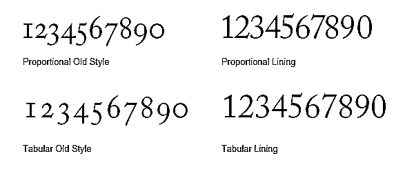 |
| Differences between Uppercase Numerals and Lowercase Numerals |
- Punctuation, Miscellaneous characters- All fonts contain standard punctuation marks, misc. characters can change from typeface to typeface.
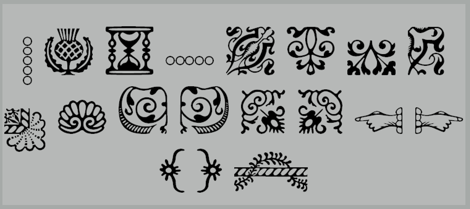
- Ornaments- used as flourishes in invitation or certificates ex: Adobe Caslon Pro
 |
| Ornaments |
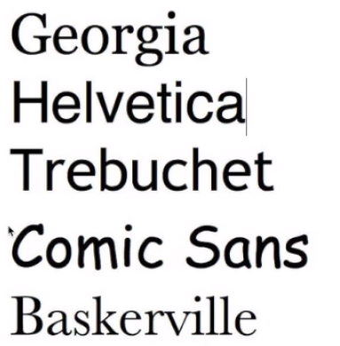
Different Typefaces
 |
| Different Typefaces |
 | |
| Difference between Italic and Oblique |
 | |
| Difference between Italic and Oblique |
Week 3
- Kerning - automatic adjustment of space between letters.
- Letterspacing- Add space between the letters
- Tracking-addition and removal of space in a word or sentence
 |
Without Kerning vs. With Kerning |
 |
Normal tracking, loose tracking, and tight tracking. |
- Gray Value: The balance between the letters and the negative space.
- Counterspace: the black spaces between the white letters. This has a bearing on readability.
- Leading: space between each line
- Shift + Ctrl + < or > will increase/decrease the point size
- For even quicker results, Shift + Alt + Ctrl + < or > will increase/decrease the point sizes
- Ctrl + : turn off margin column
- Atl +Left Arrow/ Right Arrow = Kerning
- Edit > Preferences> Unit & Increments (Change unit from 20 to 5) to move slower
- Alt+ Right arrow of the whole word = Add letterspacing.
 |
Flush left |
 |
Centered |
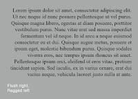 |
Flush right |
 |
Justified |
 |
| Anatomy of a typeface |
 |
| Typefaces and gray values |
.png) |
| Different leading with the same typeface |
 |
| Sample type specimen sheet |
 |
| Line Spacing VS Leading |
 |
| Standard Indentation |
 |
| Extended Paragraph |
 |
| Widow and Orphan |
- Italics.
- Bold.
- Different Typeface
- Font Size
 |
| Aligning Sans Serif with Serif |
- Type Colour
- Background Colour
- Extending Reading Axis
- Quotation Marks
| Quotation Marks |
 |
| Prime and Quotes |
 |
| A heads |
.png) |
| B heads |
 |
| C heads |


 | |
| Univers |
.png) |
| Helvetica VS Univers |
 |
| Median and Baseline |
 |
| Form/ Counterform |
 |
| Contrast |
 |
| Type for Print |
 |
| Type for Screen |
 |
| Pixel Differences Between Devices |
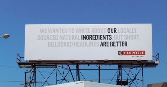 |
| Static Typography in Billboard |
Exercise: Type Expression
Part A
Idea Exploration
We were asked to come out with a few words in order to vote in a poll in the typography Facebook group. After voting, we are required to choose 4 out of 6 words to express their meaning using the appropriate typeface provided. The list of words are ring, tall, freak, fire, whisper and shatter. I ended up choosing the ring, tall, fire and shatter.
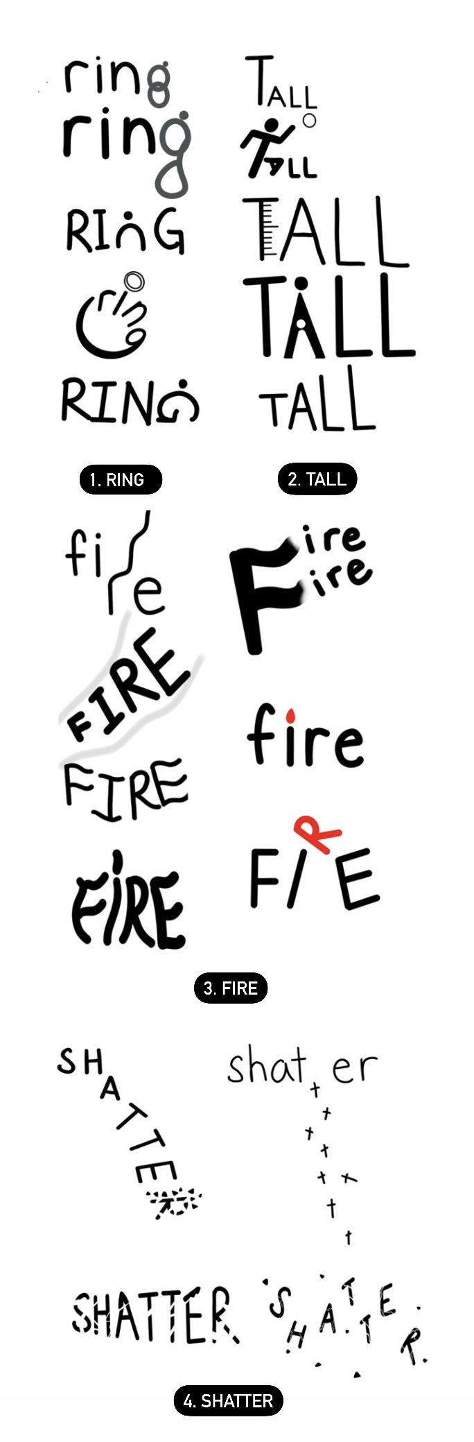 | |
| Fig 1- Sketches (6/9/2022) |
 |
| Fig 2.0- Digitalized Trial (11/9/2022) |
Final Outcome
I have refined the spacing and size of "ring" to be narrowed and slightly enlarged. The previous "tall" has been stretched, and I changed to Futura std light condensed and adjusted the line of measurement. For "fire", I straightened the word "F" ," I" and "E" and distorted "R" and placed the "I" to look more like a torch.
 |
| Fig 2.1- Type Expression (16/9/2022) |
PDF- Type Expression (16/9/2022)
Part B
Animation
During the animation process, we are required to choose one desired type expression to make it into animation by using photoshop. I choose the word "shatter" to animate.
.png) |
| Fig 3- Animation Progress in Adobe Photoshop (17/9/2022) |
In the beginning, I tried to make the fragments of the word break apart but kept the word still. I was not satisfied with the result and improved several layers to animate in the second time.
 |
| Fig 4.0- Animated Shatter Trial 1 (17/9/2022) |
 |
| Fig 4.1- Animated Shatter Trial 2 (17/9/2022) |
|
| Fig 5- Final Outcome (23/9/2022) |
Exercise: Text Formatting
Fig 6.0- Name without kerning & tracking (24/9/2022) |
| Fig 6.1- Name with kerning & tracking (24/9/2022) |
 | |
| Fig 7.0 Layouts (26/9/2022) Since the text is left aligned, the image box should be adjusted slightly smaller in order to reduce heaviness. I also realigned the headline horizontally for layout #3 after receiving feedback. |
 |
| Fig 8.0 Refined Layouts (30/9/2022) |
.png) |
| Fig 8.1 Refined Layout and Alignment |
Final Submission
 |
| Fig 9.0 Final Text Formatting Layout #3 (30/9/2022) |
 |
| Fig 9.1 Final Text Formatting Layout #3 with Grids (30/9/2022) |
HEAD
Font/s: ITC Garamond Std Ultra
Type Size/s: 44pt
Leading: 24pt
Paragraph spacing: 24pt
BODY
Font/s: Univers LT Std 55 Roman
Type Size/s: 10pt
Leading: 12pt
Paragraph spacing: 12pt
Characters per-line: 55
Alignment: Align Left
Margins: Top 12.7mm Bottom 30mm Left 11 mm Right 11mm
Columns: 4
Gutter: 4.233 mm
Feedback
Week 1
General Feedback: Mr. Vinod informed us to download the 10 typefaces provided to be used throughout this semester and reminded us not to think about animation when figuring out the type expression during the sketching process.
Week 2
General Feedback: Enough word exploration with 3 to 5 ideas. Better designs and the right expressions can be chosen to digitize with the appropriate typeface.Week 3
General Feedback: Be careful not to stretch fonts.
Specific Feedback: The word spacing of the "ring" can be narrowed and slightly enlarged. It should be noted that the word "tall" has been stretched, and suggested to use Futura std light condensed. Also, the measurement line can be slightly smaller and it does not need to be on the same line as T. For "fire", straighten the word "F" ," I" and "E" and remains placed "R" on the "I" but can try changing the direction/form to look more like a torch. Lastly, "shatter" is fine, no problem.
Week 4
General Feedback: Mr. Vinod approved my work.Week 5
General Feedback: Refine layout and alignment. Specific Feedback: Decent point size and good ragging. Although lettering is slightly dark but still in an acceptable way. The headline is not clear aligned horizontally and image box is over-scale. Suggesting to adjust it slightly smaller as the text is left aligned.
Reflections
Experience
Through the exercises of type expressions and text formatting, I became more familiar with the basics of typography, as well as the use of Adobe Illustrator and Indesign. For type expression, we were only able to use 10 fonts without graphic elements or abstract fonts to express our chosen words, which was interesting yet also challenging. The text formatting exercise was also challenging because we should pay attention to many details such as point size, leading, paragraph spacing, baseline grids, etc. It took me a long time to adjust the rivers of the line and be aware of widows and orphans, which led me to adjust the point size and margin to make the layout appropriate and comfortable to read. Nevertheless, I gained a nice learning experience in exploring how to express words with limitations and arranging and formatting text.
Observation
These exercises challenged me to think analytically about many small details and how they apply to the typography we are designing, including the style and emotions that the font evokes in the reader. Each typeface that we choose can change the way that it is received and the message that it ultimately conveys to the audience as different fonts trigger different emotional responses and associations in our minds. I have observed that as a designer, not only is it important to keep practicing design, but also important to understand the theory, which ensures that we are not just aesthetically designed but effectively designed.
Findings
Through these exercises, I found that typography has many rules and theories to follow. We should spend a lot of time practicing and reading because many design elements are closely related to typography, and there is a complex design process behind them. I've found that when doing typography, we need to pay attention to every little detail because a minor mistake can also have a huge impact. This led me to critique my work strictly so I can improve in future exercises.
Further Reading
Thinking with Type, 2nd revised and expanded edition: A Critical Guide for Designers, Writers, Editors, & Students by Ellen Lupton

 |
| The origins of uppercase and lowercase |
Typography Essentials Revised and Updated 100 Design Principles for Working with Type by Ina Saltz

 |
| Leaf-like customized logo forms |
The letters comprising the logo can accommodate images, textures, and colors to reflect different aspects of the organization’s identity and a variety of events. It is a vessel made of the letters Bklyn, the common abbreviation for Brooklyn.
 |
| Bklyn logo |
These letterforms are beautiful color-filled ribbons of abstraction. Given how spare the forms are, it is amazing that we can actually read this sentence. The letterforms suggest the vinyl ridges of an album or LP.
 |
| Color-filled ribbons of abstraction |
Comments
Post a Comment