
Leong Jia En (0348366)
Creative Media Design
-------------------------------------------------------------------------------------
Creative Media Design
Lecture Notes
Elements of Design, Principles of Design, Contrast and Gestalt Theory
👉Elements of Design
- The building blocks for a successful composition to produce an artwork.
- Dots - The simplest elements of design, used as repetitive marks to form a line.
- Lines (straight/curved/active to statics) - use to indicate directions, define boundaries of shapes & spaces, imply volumes and suggest motion or emotion.
- Shape (geometric & organic) - use lines, colours to create enclosed areas.
- Form - use to create a three dimensions area.
- Texture (actual & simulated) - use to define an object's surface.
- Space (positive & negative) - use the blank area around a "positive" shape to create a figure/ground effect.
- Colour - use to set a theme or tone and attract attention.
 |
| Source: https://www.onlinedesignteacher.com/2015/11/design-elements_91.html |
👉Principles of Design
- The organisational fundamentals used to organize or arrange elements.
- Balance
- Repetition
- Contrast
- Harmony
- Emphasis
- Scale
- Movement
 |
| Source: https://www.wix.com/blog/2018/07/7-principles-of-design-websites/ |
👉Contrast
- Contrast refers to differences in values, colors, textures, shapes, and other elements.
-It provides visual interest, emphasises a point and expresses content.
 |
| Source: https://pin.it/1BjUcd9 |
👉Gestalt theory
- A theory about how the human eye perceives visual elements.
- The human brain is wired to see patterns, logic, and structure.
- These principles aim to show how complex scenes can be reduced to more simple shapes and also how the eyes perceive the shapes as a single, united form rather than the separate simpler elements involved.
- Similarity - The human eye tends to see similar elements in a design as complete pictures, shapes, or groups, even when those elements are separate.
- Continuation - The human eye follows the paths, lines and curves of a design, preferring to see a continuous flow of visual elements rather than separated objects.
- Closure - The human eye prefers to see complete shapes. If the visual element is incomplete, the user can perceive the complete shape by filling in the missing visual information.
- Proximity - The process of ensuring that related design elements are put together. Close proximity indicates that items are connected or have a relationship and become a visual unit that helps organize or give structure to a layout.
- Figure/Ground - Objects are instinctively perceived as being in the foreground or background. They either stand out in front (picture) or recede to the back (ground).
- Law of Symmetry & Order -The law states that elements that are symmetrical to each other tend to be seen as a unified group.
 |
| Source: https://pin.it/7fQ7GTb |
Exercise 1
Create 1 design of Gestalt theory and 1 design of Contrast.
Part A: Contrast
These are contrast inspirations I found, including contrast in colour and size. In terms of colour contrast, blue complementary colour will be orange and yellow. As shown in Figure 1, the yellow and blue look absolutely stunning when combined, which led me to utilise the colours of Figure 1 to create a new piece.
 |
| Figure 1 (Source: https://pin.it/3kUK1q6) |
Besides, the black and white deer in figure 2 inspired me with another idea of colour contrast.
 |
Figure 2 (Source: https://pin.it/IrF7dGb) In terms of size contrast, I was very impressed by the huge shark and the tiny human in figure 3, so I decided to create a design with the same theme. |
 |
| Figure 3 (Source: https://pin.it/1GUEcc1) |
As being inspired by the white and black deer shown in figure 2, I came up with the idea of combining polar and black bears as draft 1.
%20(2).png) |
| Draft 1 |
Then, I change the background colour to blue as shown in draft 2 to make polar and black bears more visible.
%20(2).png) | |
|
Next, this is the idea of a boy walking under the light at night, with a contrasting blue and yellow.
.png)
Lastly, the idea was the size comparison of shark and human. This design depicts the shark chasing human, highlighting the tense atmosphere and the murderousness of the shark.
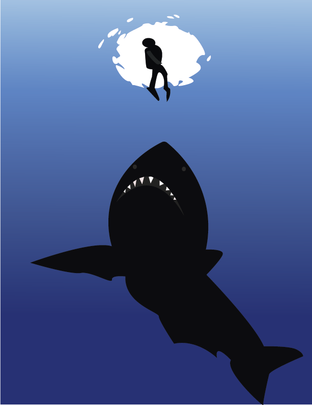
Final Design Outcome
.png)
Contrast (Polar bear and Black bear)
The message of this design is about the combination of a polar bear and a black bear contrasting each other. In the final design, I decided to curve the straight line in the middle of the bear as suggested by Dr. Jin Chi to create an organic look.
.png) |
| Contrast (Polar bear and Black bear) The message of this design is about the combination of a polar bear and a black bear contrasting each other. In the final design, I decided to curve the straight line in the middle of the bear as suggested by Dr. Jin Chi to create an organic look. |
Part B: Gestalt Theory
Based on Gestalt Theory, I was interested in the Principle of Figure/Ground and the Principle of Closure.
I found these two main references to generate new ideas.
 |
Figure 4 (Source: https://pin.it/3WEzQVI ) |

I decided to design a whale and a woman’s face. The half of the whale's tail can also be a woman's mouth from another perspective. I made a total of 3 colour drafts to compare which one is more harmonious.
.png) |
| Draft 1 |
.png) |
| Draft 2 |
.png) |
| Draft 3 |
Apart from that, I drew the texture of the sea turtle's body and shell to create the closure effect.
.png)
 |
| Gestalt Theory (Whale and Woman) |
Regarding the final outcome, I decided to use draft 3 as my gestalt theory artwork. The significance of this design is to call for peaceful coexistence and mutual respect between humans and whales (sea animals).
Comments
Post a Comment